In Production
Redesigning the participant profile
A participant-facing project at Prolific. Redesigned the about you page to drive higher completion — shipped to 100%. Increased completion rate from 25% to 68%
Role
Lead product designer
Timeline
2026 · 2 months
Team
1 PM, 4 Engineers
Status
Shipped to 100% users

Redesigning participant profiles flow
Redesigned Prolific’s “About You” profiles flow to help data collectors find niche participants faster by reducing overwhelm and friction. Added priority questions + a dashboard prompt + usability fixes.
I led this project as the sole designer — driving problem framing, research, and interaction design — while partnering closely with 4 engineers on the system-level design decisions. The PM's role was scoped to prioritisation and business context; the design and technical judgement calls were mine and the engineering team's to make together.
The problem
Prolific wants to collect information from participants quickly
The "About You" page is where Prolific participants share background information that determines which studies they're eligible for.
As Prolific increasingly supports AI research and niche data collection, clients began requesting participants with rare, specific backgrounds — particular professions, technical skills, lived experiences. Prolific theoretically had these people. The problem was reaching them quickly enough.

HMW statement
HMW collect high-value information from participants quickly, when it matters most?
Phase 1 - Understanding the problem
Prolific want to collect information from participants quickly
I ran a survey with 100 participants, 10 user interviews, and a behavioural data analysis. I came in with hypotheses — the research confirmed them.
Participants weren't completing the page
With 200+ questions and no sense of priority, most either dropped off early or answered once and never came back.
Participants didn’t know when to update or answer new questions
When our team needed specific information, participants had no way of knowing — making it slow and unpredictable to source the right people.
The experience had unnecessary friction.
A product walkthrough I ran before research began surfaced two usability issues that were quietly undermining completion.
Phase 2 - High level direction
Monterey vs non-monetary way
I explored two directions to begin with: paying participants to complete their profile, or nudging completion through UX alone.
Paying was tempting — it works. But at Prolific's scale, a recurring incentive would have pulled money away from research studies and undermined marketplace economics. The intervention had to be sustainable. Non-monetary won — which meant every UX detail had to work harder.
Monetary way
We pay participants to fill out their profile

Non-monetary way
We nudge them to fill out their profile without paying and frame it differently

Phase 3 - Ideating many solutions
Key decisions
Through iterations with engineering and PM, three principles emerged:
Prioritise action over exploration — surface the fewest options that lead to a clear next step.
Use simple, universal terms — avoid Prolific-specific jargon that expert participants might misread.
Make it obvious, not overwhelming — the fewer decisions users face at once, the more likely they'll act.
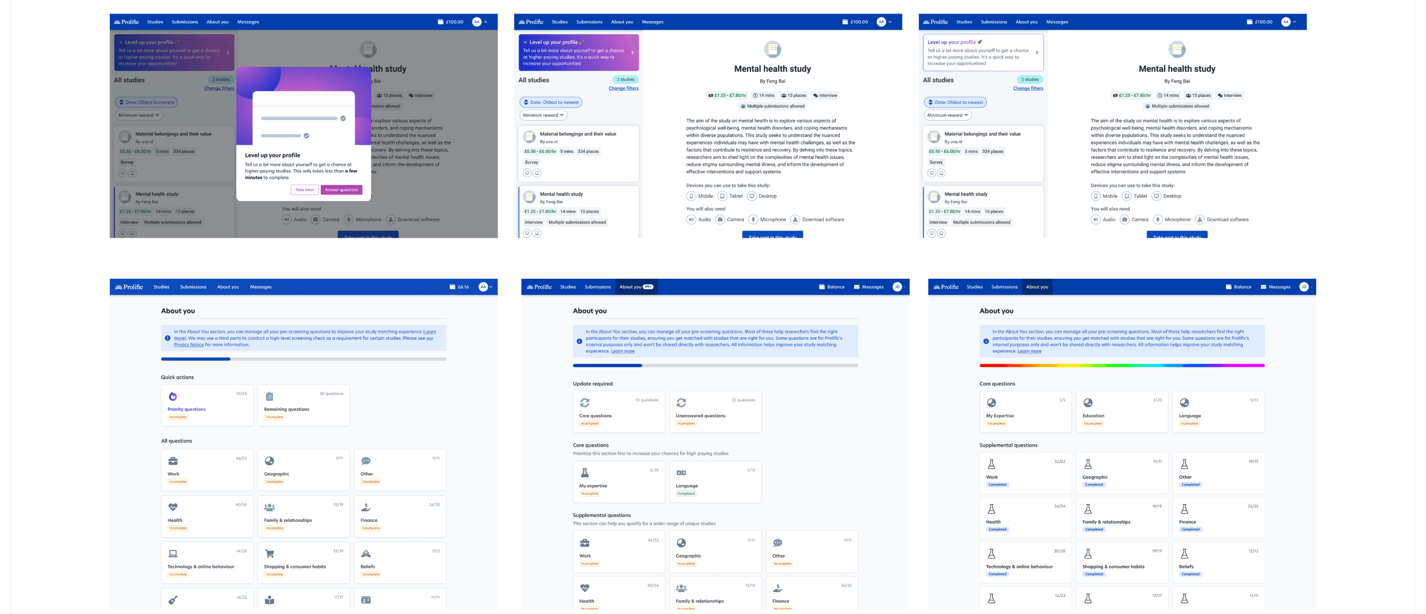
The solution
Priority questions
Working closely with our internal data team, I designed a dedicated "Priority questions" section on the About You page. I collaborated on the criteria for which questions qualified, how many to surface at once, and any conditions before a question appeared.

Contextual dashboard prompt
This was my initiative end-to-end. When a participant had unanswered priority questions, a prompt appeared above their study list — visible but not blocking.
The trigger conditions — when to show the prompt, when to suppress it — were set with engineering. We aligned on a set of rules that made the system feel restrained rather than pushy:
Capped at 10 questions, once per day to avoid fatigue and keep the commitment feeling small
One question at a time, with both Skip and Save advancing — so participants never felt stuck
A visible opt-out in Preferences, keeping participants in control

Usability enhancements
Through my own product walkthrough, I identified two friction points undermining completion: participants had to save answers one by one, and unanswered questions were buried in long category lists. We introduced bulk saving and restructured each category to surface unanswered questions upfront.

Results
Participants answer much faster than ever
Because of new priority question section and prompts, participants answer the most important questions for us much faster than before.
From 25% to 68%
Completion rate for the priority questions on the About You page
Reflection
What I'd do sooner: pull engineering in earlier
Aligning with engineering on constraints from kickoff was the single biggest reason this project moved as fast as it did. If I did it again, I'd bring them in even earlier — before the design directions were fully framed. Some options got explored longer than they deserved before the technical reality closed them out.
What I've carried forward: constraints first
Defining constraints before diverging on solutions raised the quality of every option that followed. It sounds like it would limit creativity, but the opposite happened — we stopped generating ideas that couldn't ship, and every remaining idea was one we could actually build well. I've kept this pattern in every project since.
Other projects

Redesigning participant pricing for data collectors
Redesigned how data collectors set participant pay — tested, iterated, and shipped to 100%. Drove 12.2% revenue uplift.

New sign up flow for expert participants
Redesigned the expert sign-up flow, cutting a 7-page form to 2 and adding a fast-track path around the waitlist. Shipped and A/B tested.